
The first stage in using Chart Wizard is to have a table of data, organised logically.
Creating a table on which to base your chart:
- In Excel, open a new spreadsheet, and enter the following data:
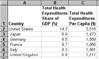
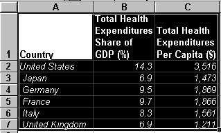
- With the cursor in the top left-hand cell of the table (A1), select the table by clicking and dragging the cursor to the bottom right-hand cell (C7):
- From the toolbar, select the Chart Wizard icon

You will notice the cursor has changed to a hair-cross with a miniature icon beside it.
- With the cursor in a suitable place on the spreadsheet, click-and-drag to select an area where your chart will be inserted. You can re-size and move it later, if wanted.
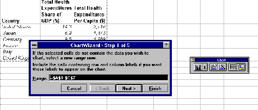
- Step 1: Upon release of the mouse button, you will see:
Click on Next>
- Step2: Select Combination from the Chart Type screen:

Click on Next>
- Step 3: Click on image 2 of the Chart Format screen:

Click on Next>
- You will see:
- Step 4: You will see:
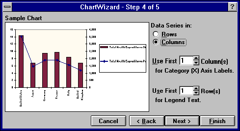
- With details as shown above, click on Next>.
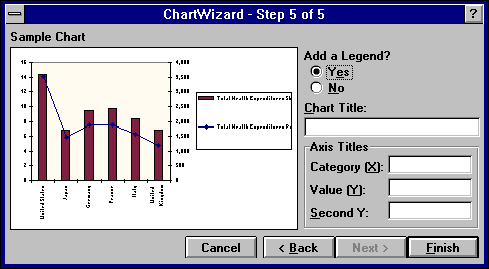
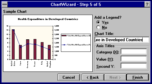
- Step 5: You will see:
With the options as shown, click once in the Chart Title: box. Type in: Health Expenditure in Developed Countries.
You will see the title words appearing slowly on the Sample Chart:
 .
.
Click on Finish . You will see:
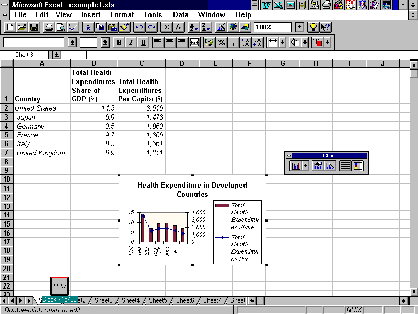
- Click once anywhere on the spreadsheet (outside the area of the chart) to close the Chart Wizard tool box. Your chart is now finished.
To alter the size or position of your chart:
- In the above example, the chart is not a suitable size, and the labels cannot be read clearly. To re-size the chart, select it by clicking once within the area of the chart. As in the illustration above, black 'handles' will appear on the corners and centres of the outline.
- Place the cursor on a corner handle, so it changes to a double-ended arrow. Click-and-drag the outline to a slightly wider, and much deeper, shaped box:
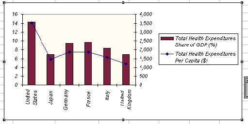
Notice that some of the labels which were not shown earlier have now appeared, and the chart is clearly labelled.
Some elements of your chart may need editing, eg: coloured lines and fills may not show up well when printed in black and white.
To edit chart features:
- Click once within the area of the chart to select it.
- Double-click on lines or bars on the chart to open Format Data Series prompt boxes:
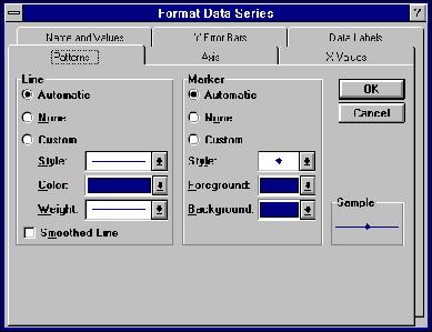
Here you can edit the pattern, style and colour of the line or bars and several other options covering the source of the data, and the arrangement of the axes. Note that when you change the pattern of a line or bar, the legend will change to match it.
- Double-click on words or axis labels to Format Axis:
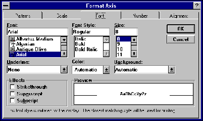
Where you can format the pattern, scale, font, number and alignment of labels and legends.
To edit the chart details:
- If you find that you have entered some information incorrectly, or which to delete some records, or wish to change data labels, you can change these directly in the base table, and the chart will automatically adjust.
If you want to print out a chart, separately from the spreadsheet:
- Click on the chart to select it
- From the menu bar, choose File, and click on Print...
- From the options box, click on Selected Chart; click on OK
This will print the chart by itself, scaled to fit the page.
To place your finished chart into a MS Word document:
- Select the chart by clicking inside the area of the chart
- From the menu, choose Edit, click on Copy;
OR
click once on the icon
icon
- Open your Word document, click once on the part of the document where you want the chart to be placed. From the menu, choose Edit, click on Paste
OR
click once on the icon. This will insert the chart into your Word document.
- To add a border or a caption to the chart in Word, see Word Tutorial Part 12.